
UX Web Design and Branding
Creating an equitable and accessible digital platform for post-graduates of colour
With The University of Sheffield’s Centre for Equity and Inclusion
The vibrant and user-centric platform is a central part of the Centre’s community engagement.
The Story
The Centre for Equity & Inclusion is a research hub at the University of Sheffield. It seeks to enhance the university experience for postgraduate researchers (PGRs) of colour, whilst challenging racism and other systems of power within and beyond higher education.
They do this by providing a comprehensive programme of support and opportunity for PGRs. They also collaborate with ten local partners experienced in racial justice work to explore and enact anti-racist praxis.
Postgraduates of colour at the University of Sheffield face unique challenges, including racial isolation, microaggressions, and a lack of institutional support. Many students have reported feelings of exclusion, leading to a gap in community and support that contributes to academic and social disengagement.
Key Challenges:
- Lack of inclusive digital spaces for postgraduates of colour.
- Difficulty in finding mentors and support specific to their experiences.
- Limited visibility of resources for personal and academic development.
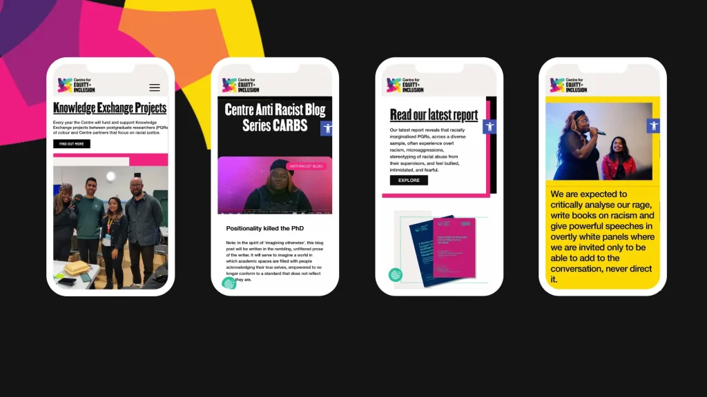
For the Centre, we focused on creating a website and branding that authentically represented their core values of inclusivity, equity, and community engagement. The project started with in-depth research to understand the organization’s key audience. While primarily this is PGRs of colour, it also spans local communities, activists, and policy-makers. We employed a user-centered design approach, informed by UX research and stakeholder interviews, to ensure the website met the diverse needs of its visitors while reinforcing the Centre’s mission of promoting racial justice.
The branding was crafted to embody the Centre’s values visually, using a bold and inviting color palette, coupled with inclusive imagery that represents the vibrancy of the communities they serve. Accessibility was central to the UX design, ensuring that all users, regardless of ability, could easily navigate the site. Clear information architecture was employed to prioritize content like resources, events, and activities, with a seamless user journey from landing on the homepage to taking meaningful actions like signing up for workshops or accessing resources. The result is a cohesive digital presence that not only amplifies the Centre’s voice but also empowers its audience to engage and act.
Sector
Racial Justice
Services
Discovery Activities
Web Brief
Branding and Visual Identity
Style Guide Design
Mockup Design
Full Stack Development
Quality Assurance
Accessibility
Training & Support
Explore
Share
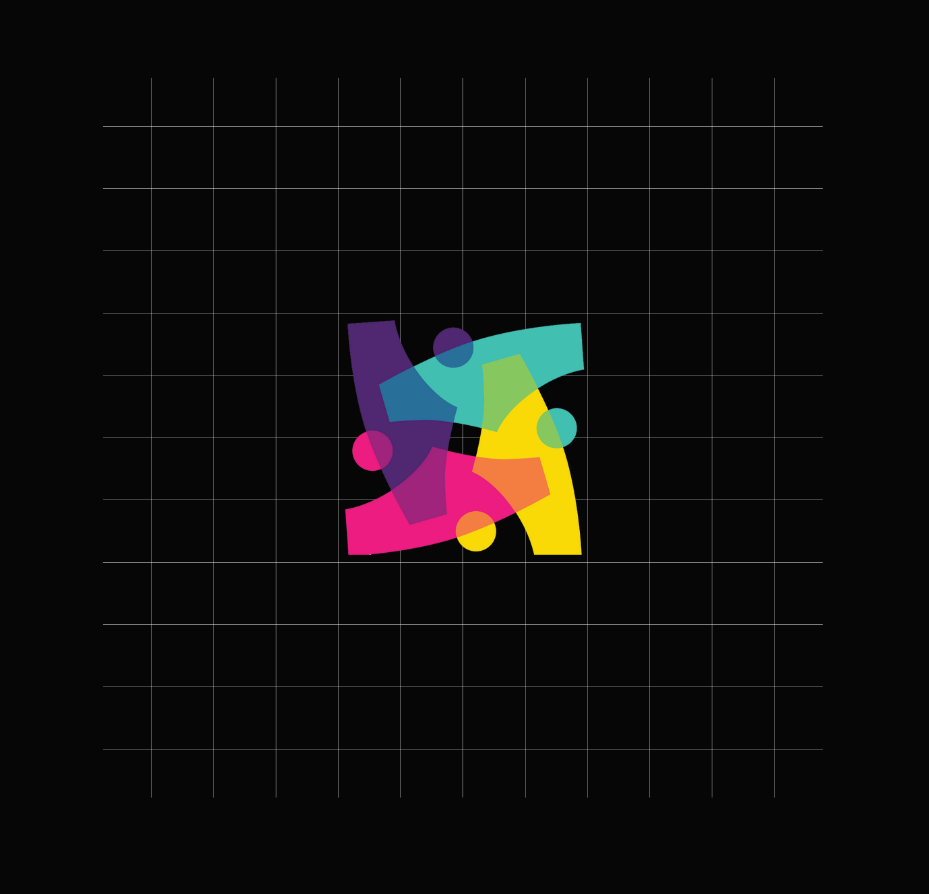
The logo was designed as a reflection of the Centre’s intersectionality and community-led values.
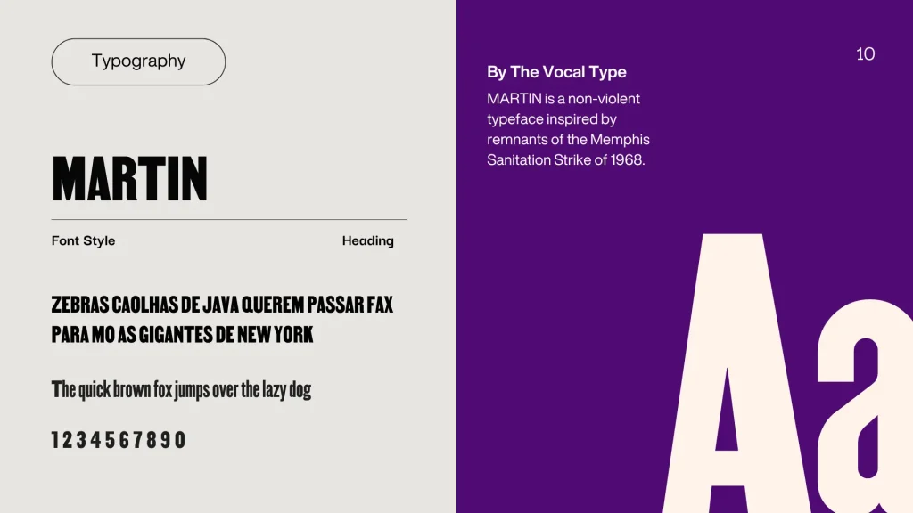
Memphis sanitation workers, the majority of them Black, went out on strike on February 12, 1968, demanding recognition for their union, better wages, and safer working conditions after two trash handlers were killed by a malfunctioning garbage truck. This font was designed by The Vocal Type. You can read more about the font Martin here.

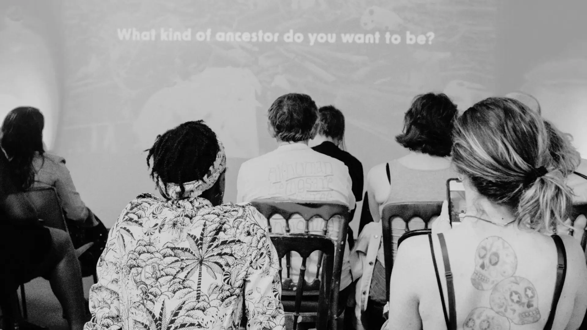
The Centre organised and hosted ‘The Cut’ event to promote mental & physical health in Black communities.

The colour palette was inspired by Amanda Williams’ Color (ed) Theory Exhibition at the MoMA. You can read more about her work here, in the article ‘What Color is Racism?’
Whether you’re looking to create an inclusive website, impactful branding, or a community-driven digital campaign, our team is dedicated to crafting designs that reflect your values and drive positive change.
Together, we can build solutions that inspire action and transform communities for the better.